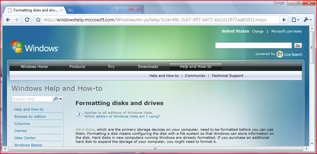
Google Stole My Menu Bar
I knew there was something bugging me about Chrome, but I just couldn’t put my finger on it. I finally realized what it is: There’s no menu bar!

File. Edit, Help, all those useful things we’ve learned to depend on: they’re gone. Instead, there are a couple of non-standard icons hiding in the right hand corner, off to the side of the location bar. At least they had little down arrows to indicate they might be menus. Otherwise I never would have found them.
I’m not surprised to see this “innovation” coming from a company that seems to believe the only purpose of a desktop GUI is to connect you to the cloud and then get out of the way. After all this leaves an extra 15 vertical pixels or so for the web site to use for its own purposes. Nonetheless, this feels like a step backwards. Menus, and menu bars at the top of the screen, are an improvement over the old way of doing things. I do believe that web applications need better support for menu bars. Perhaps there should be a way for a web app such as Google Docs to tell the browser it wants to take control of the regular menu bar (though the security and UI implications of that would be thorny). However completely eliminating the menu bar is a step backwards. Here’s hoping Google fixes this when they release the Mac version.

December 30th, 2008 at 10:14 AM
I believe this “innovation” actually began with Microsoft’s IE7. I’m not sure why the Google-folk decided to copy it.
December 30th, 2008 at 10:48 AM
Hmm, looks like you’re right. I almost never launch IE, nor do I associate with people who do, so I hadn’t noticed. :-) In any case, I still think this is a bad idea. In fact, IE hides the menus a little more effectively than Chrome does. However they do have a setting to turn the menu bar back on in the Tools menu in the button/tab toolbar. (A toolbar is not an adequate substitute for hierarchical menus. A toolbar is at best a supplement and at worst a waste of valuable screen real estate.)
Even when the menu bar is turned on, IE puts it at the wrong place, below the location bar rather than at the top of the window. Oh well, Microsoft has been putting the menu bar in the wrong place for 20 years. It’s not like they’re suddenly going to get it right now.
December 30th, 2008 at 2:30 PM
Personally I like the IE solution. The menu bar is hidden until you want to use it — then just press the alt key and up she pops. In the meantime there’s more real estate for web pages.
December 31st, 2008 at 7:25 AM
Wow, that’s bad design; and in fact completely contrary to what menu bars are for. The point of a menu is that “see and choose” is faster and easier than “remember and type”. Apparently by default in IE, you now have to remember and type to get the menu from which you can see and choose.
December 31st, 2008 at 8:11 AM
If it’s bad design it’s bad design that works well for me. (Or worked well for me — I mostly use Chrome and Firefox lately.) I don’t find having to remember one key overly burdensome. I typically preferred using the alt-key convention for accessing the menu bar anyway, so I already had that key pretty well memorized. And as you pointed out, it’s optional. If you prefer having the menu bar there all the time you can choose that option, but my preference is the ‘bad design’ option of having it go away until summoned. I rarely need to use the menu bar, so I find the larger useable window of no-menu preferable to the easier mouse access of always-menu.
April 13th, 2010 at 9:31 AM
I have no problem with the menu bar being off by default. However Chrome does not give you any option to show the menu bar, as all the other browsers do. For this reason, and this reason alone, I uninstalled it on the second day. There are too many browsers out there that let me customize the UI the way I want, to put up with a FORCED change without the menu bar.